iPhone XS
After Apple announced the iPhone XS last month, I found myself having to consider a question I hadn't considered since the spring of 2007: am I getting a new iPhone?
Coming out of the keynote, the answer was “no”. The iPhone X presented a truly monumental improvement over the Plus form factor and is a phone I actually have no complaints about. The phone is fast enough, Face ID works well for me, the cameras are excellent, and coming from a 7 Plus, I didn't lose screen size by moving to a physically smaller phone.
In contrast to other “S” years, which brought autofocus and video recording (3GS), Siri (4S), Touch ID (5S), 3D Touch and optical image stabilization (6S), the iPhone XS’s slight speed and questionable camera improvements made it seem as though there just wasn’t enough there to warrant upgrading to an iPhone XS from the iPhone X.
So what am I doing writing about my experience with the iPhone XS? Well, one thing that is significantly different this year is the availability of a larger model. I really like the iPhone X size (finding the 6/7/8 too small and the Plus too large), but since old habits die hard and I was planning on waking up to pre-order a new Apple Watch anyway, I figured I might as well tack on a XS Max to my order and give it a go for a couple of weeks.
The iPhone XS Max is more pleasant to use single-handedly than the 6s and 7 Plus, primarily due to the improved grippiness of the glass back over the soap bar-like aluminum back of the older phones. Still, many UI elements, and most importantly Control Center, are impossible to reach without using two hands.
Most apps I use on a regular basis haven't been updated to take advantage of the larger screen (and so present a scaled up 5.8″ interface), and aside from supporting a “regular” landscape size class over the “compact” one of the 4.7″ and 5.8″ iPhones, neither has iOS. Unless you find yourself watching a ton of video or have another compelling need for the larger screen, there's not a lot of benefit to the larger screen of the XS Max in October of 2018.
In previous years, upgrading to the Plus models afforded a higher density screen and an improved or additional camera. This year’s iPhones are the first time that the two sizes of iPhones are offered with no internal difference aside from the Max having a larger battery, which provides an extra hour of battery life.
After getting used to the 5.5″ Plus and then handling a 4.7″ iPhone, the smaller phone felt too small. After getting used to the 6.5″ Max and then handling a 5.8″ iPhone, the smaller phone feels just right.
Does this mean I’m sticking with my iPhone X? Going solely by the keynote and my personal preference towards the smaller phone, the answer would be “yes”. However, the general consensus is that the keynote this year greatly undersold the iPhone XS’s camera improvements. I personally found the camera segment to be uncharacteristically technical; it seemed far too concerned with not hurting previous iPhone’s feelings than it did with describing how much better the XS’s camera is than the specs suggest.
The many reviews that came out between pre-order and launch had no such qualms, and are what ultimately pushed me towards an iPhone XS. John Gruber’s review, Austin Mann’s camera review, and Sebastiaan de With’s technical deep dive all go into how Smart HDR salvages otherwise-unusable photos and how the larger sensor allows for better low-light photography (which is not without its trade-offs, as de With discusses).
As with every other “S” phone, many will dismiss the XS because it looks the same as the previous generation. On the flip side, tech specs rarely tell the whole story, and that’s what Apple focused on at the keynote last month. Even though incremental improvements seem smaller each year, 2-3 years of incremental improvements adds up to something significant.
As iPhone cameras have gotten better, I’ve been leaving my real camera behind, and having the best iPhone camera possible is a pretty big priority for me, so upgrading to the XS (and giving me the opportunity to get on the iPhone Upgrade Program) is a no-brainer. If you’re on an older phone and itching to upgrade, there’s no reason not to (well, maybe one reason: the iPhone XR, a lower-cost alternative to the XS, which ships next week). If you’re on an iPhone X, consider how often you’re hitting that 10% battery warning, how much video you watch, and how many photos you throw away. If it’s a lot, an iPhone XS or XS Max may be more than a minor upgrade to you.
Amazon Echo Review
I like the concept of a hands-free, always-listening virtual assistant, but I don’t get a lot of use out of iOS 8’s “Hey Siri” because the times I use Siri don't usually correspond with the times my phone is plugged in. When Amazon announced the Echo, a Siri-like device minus the screen, I signed up for the waiting list right away and purchased one as soon as I received my invitation on December 19th.
The Echo is packaged in a non-descript black box with an orange interior. Inside the box is the device, power adapter, remote, batteries, and remote stand. There’s also a quick start pamphlet which I can only assume was printed before the Echo name was decided on. There's no mention of “Echo” in the guide to the point of it being awkward – it’s either “your device” or “Alexa”. In fact, the guide sends you to amazon.com/alexasetup and asks for feedback at alexa-feedback@amazon.com.
The Echo’s launch was strange in other ways too. For one, none of the major tech sites have reviews and there’s no way to leave a review for the Echo on Amazon itself; clicking the “Leave a Review” button on the order page took me back to the Echo’s marketing page. Finally, the return period for the Echo is 180 days, in contrast to 30 days for Amazon’s other hardware products, and—SPOILER ALERT—returning it requires a call to Amazon customer service.
Setup is straightforward: You connect your phone to the Echo’s WiFi network and set it up through the companion app. The companion app is terrible. For one, it isn’t optimized for iPhone 6/6 Plus. Second, it’s non-native, and built using some framework that doesn’t even support the rubberband scrolling that’s been in iOS since 1.0.
The voice recognition is spot-on, and the microphones work so well that the Echo can pick up my voice at a normal volume from anywhere in my living room.
However, while Echo can hear me just fine, there isn’t a whole lot you can have it do. It’ll play the news from NPR, the BBC, and a few other stations, play music from Prime Music (both music you’ve purchased and from their streaming service), tell you the weather, answer basic questions (e.g., “How tall is the Empire State Building?”), and add items to your to-do/shopping lists. That’s it.
It doesn’t integrate with calendars, so you can’t ask Echo to tell you what’s on your schedule for the day. Asking for what’s on your calendar for the day will instead give you a Flash Briefing from the news outlets you've configured.
Echo inexplicably maintains two distinct to-do lists, a to-do list and a shopping list, and they both have pretty much the same functionality. For example, neither list allows you to set a date on an item, so “Alexa, remind me in half an hour to check on the oven” becomes the item, “Half an hour to check on the oven”. The only difference between the two lists is that to-do items let you play back what you’ve said to the Echo and shopping list items let you search Amazon and/or Bing for the text of the to-do.
I thought I could hack around the lack of due dates on to-do items by using timers, but it turns out you can only set one timer on the Echo. Even worse, setting another timer while one is active will silently replace the old timer.
Other things you would like the Echo to do, it just doesn't do. When I ask, “How long will it take to get to Laguardia?”, it responds with, “Your current location is 3,570 miles from Laguardia. As I don't know your speed, I can't tell you how long it will take.” If I repeat the question but instead specify “Laguardia International Airport”, Echo tells me it doesn't understand the question but that it‘s “added a Bing search to the Echo app”.
Yup, you’re awkwardly reminded of the fact that the Echo uses Bing every time it can‘t parse a command. There was no way I could find to change the search engine, which really sucks.
To wit: the Bing search‘s first result for my “how long will it take to get to Laguardia International Airport” query is a woefully unhelpful Yahoo! Answers page on how long it takes to get to JFK from Laguardia. The same query on Google results in a Google Maps answer box containing directions from my current location to LGA.
If you’re in the market for a Bluetooth speaker and you don’t need it to be plugged in all the time, then the Echo may be worth considering. If you’re looking for anything more than that, you’ll find the Echo to be a half-baked product with many rough edges. The iOS companion app is an embarassment and it’s lack of integration with any type of calendar or map service make it hard to justify as a productivity tool. It makes for a fun tech demo, but as an actual product that costs actual money, I found that the Echo is way too limited and has no place in my life.
Why $16B for WhatsApp Isn't Ridiculous
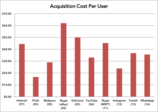
This tweet by Espen Antonsen about Microsoft’s 1997 acquisition of Hotmail got me thinking about acquisition costs per user, so I ran the numbers for other social network acquisitions.
It turns out that Facebook’s purchase of WhatsApp at $35.56/user ($42.22/user if we also include the $3B in RSUs) is in line with average acquisition costs of $35-$40/user.

| Target | Acquirer | Date | Amount ($M) | Users (M) | Cost / User |
|---|---|---|---|---|---|
| Hotmail | Microsoft | 12/31/97 | $400 | 9 | $44.44 |
| Geocities | Yahoo | 1/28/99 | $3,600 | 19 | $189.47 |
| Flickr | Yahoo | 3/25/05 | $25 | 1.5 | $16.67 |
| MySpace | News Corp | 7/1/05 | $580 | 20 | $29.00 |
| Skype | eBay | 10/1/05 | $3,100 | 50 | $62.00 |
| Delicious | Yahoo | 12/12/05 | $15 | 0.3 | $50.00 |
| YouTube | 10/9/06 | $1,650 | 50 | $33.00 | |
| Skype | Microsoft | 10/13/11 | $8,500 | 188 | $45.21 |
| 4/12/12 | $715 | 30 | $23.83 | ||
| Tumblr | Yahoo | 5/20/13 | $1,100 | 30 | $36.67 |
| 2/19/14 | $16,000 | 450 | $35.56 |
Sources:
Blown Away: The Olympus OM-D EM-5
For better or worse, I make major photographic equipment decisions shortly before I get on a plane to a far off land. Though I’ve taken my Canon 40D on multiple trips, I’ve always felt limited by its size and its shortcomings in low-light (despite shooting with an f/1.4 prime and an f/2.8 zoom). Shortly before my trip to China this past May, my Gear Acquisition Syndrome flared up and I began looking for a replacement.
Since the 40D’s release six years ago, Canon’s prosumer line of cameras hasn’t improved much. I considered upgrading to the 5D Mark II, which has a full-frame sensor that provides better performance in low-light, but the prospects of doing so became much less compelling after I compared its size and weight to my already burdensome 40D.
So began my research into mirrorless systems. I had already toyed with a Micro-4/3 system camera a few years back, but its lack of a viewfinder really turned me off. Sony’s NEX-6 and NEX-7 have received good reviews, but the Olympus OM-D EM-5 was really the king of mirrorless cameras.
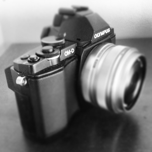
I found a great deal on a black OM-D EM-5 with the 17mm f/1.8 and 45mm f/1.8 prime lenses and picked up the 9-18mm lens for ultra-wide shooting. Although the two prime lenses have great reputations, I expected a drop off in image quality, low light capability, and usability due to the camera’s smaller sensor and body. The camera proved me wrong right away when I took the camera to see a band made up of second-year MBAs perform at Webster Hall late last semester. Due to the increase in noise associated with higher ISOs, I don’t feel comfortable cranking the 40D past ISO 1600. That night, however, the fast-moving subjects and lack of light forced me to shoot the E-M5 at ISO 6400. I expected the images to be full of noise and generally not publishable, but I was blown away by the camera’s performance.
The images are not completely noise-free, but the noise has, as Jonathan Auch describes it, “a very special, almost organic or ‘film-like’, quality”. Rather than detract from the photograph by showing the limitations of the equipment it was captured on, the noise adds to the aesthetic quality of the image.
Thanks to the camera’s performance and it’s small size, I feel comfortable taking the camera anywhere – I no longer fear that a lack of available light will result in me carrying around a heavy, useless piece of equipment. The Olympus’s small size also makes it feel less intrusive to shoot with. While I do feel more comfortable shooting through the electronic viewfinder, not having to hold up a cubic foot of camera to my face to snap a picture allows me to be subtler in my captures. Thanks to the tilting screen, I can literally shoot from the hip to capture candids that I never would have been able to capture on time or had the nerve to shoot with a larger DSLR.
The rise of excellent optics in smartphones has already put a crunch on the point and shoot market. If an iPhone 5s’ camera is good enough for National Geographic, it’s good enough for Joe’s family vacation. Image quality in smartphone cameras are “good enough” for dedicated use and an abundance of sharing options on all mobile platforms make getting photos out into the world much easier than having to find a USB cable or card reader to get photos on to a computer.
Similarly, the performance of mirrorless systems (Canon and Nikon’s half-hearted attempts notwithstanding) has come close to matching that of DSLRs. While there are still some high-end pursuits that require top-notch image quality at all cost, most hobbyist photographers will find that the convenience of a mirrorless kit, weighing a third of their DSLR kit, that still produces excellent qualities make the decision a no-brainer.
The far superior performance-to-weight ratio of this breed of cameras cannot be overstated. The OM-D EM-5 is light and small enough that I have it in my bag and carry it with me every day. It’s no longer the case that “the best camera is the one I have with me”, but rather, “I always have the best camera with me”.
Shooting Without A Viewfinder
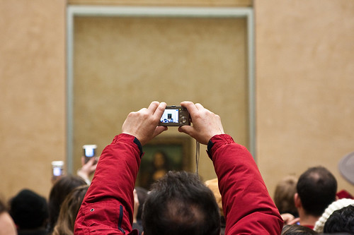
My biggest hangup with the RX1 is psychological. Frankly, I just kind of feel like an idiot using it. It doesn’t have a viewfinder (optical or electronic) and so to frame shots you’re left to hold the camera in front of you and look at the (stunning) LCD display…like an octogenarian tourist trying to get a snap of the Mona Lisa. The process just feels a little silly to me after having spent so many years hiding my face behind large DSLR bodies and lenses. You definitely look like a fresh-out-of-Best-Buy amateur with this thing.
I’ve gone through a couple of viewfinder-less cameras in my search to find a lightweight replacement my DSLR and Justin sums up exactly how I felt after using them. It seems stupid to worry about how you feel when shooting, but if it’s something that keeps you from taking a shot, then the whole point of a carrying a more portable camera disappears, no matter how well it compares to a DSLR.


